How to review your new website, using the 7 second rule.

Let's chat...call us on 44 (0)845 130 9066

How to review your new website, using the 7 second rule.

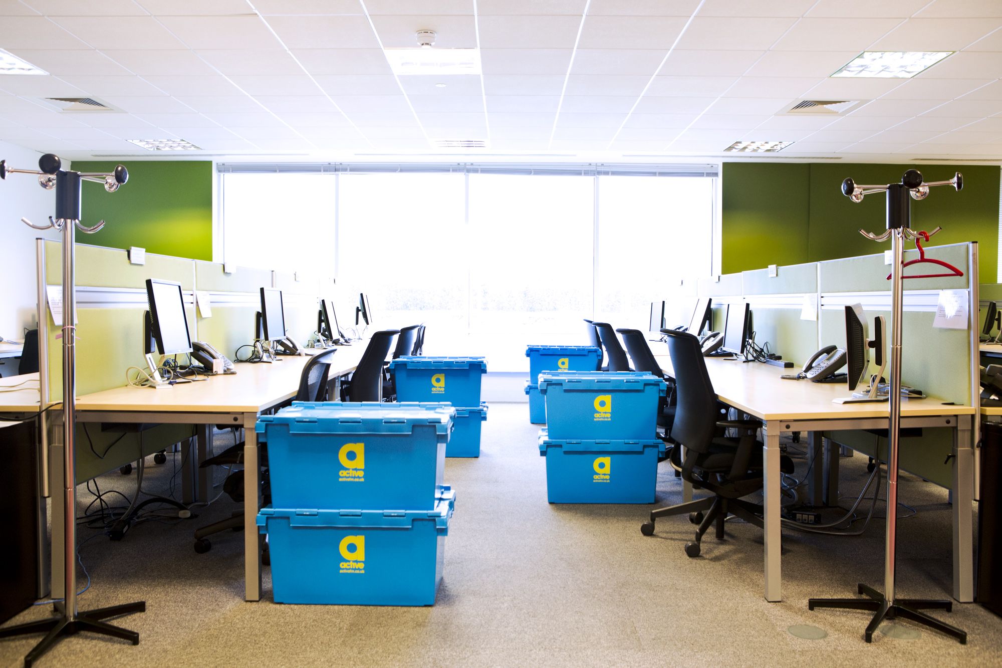
In an age where you can look up whatever you'd like and get an answer from Google within around 0.45 milliseconds (give or take a few). We have shorter and shorter attention spans, meaning that we can become more easily distracted. As such it is crucial that your business has a well designed office to minimise distractions and promote productivity. If you would like to learn more about our managed offices give our team a call on +44 (0)845 130 9066.


Our New Fantastic Website!

Given the fast paced; everything at your finger-tips era that we live in, it only takes us around seven seconds to form a first impression of someone. Similarly, it only takes us seven seconds to form an impression of a business's website. First impressions are very important to us in our managed offices and as such we have decided that it was time to re-launch our website.

We initially made the decision to re-launch our website back in October last year with the help of Wokingham based E-commerce solutions company, Advansys. Creating and designing the new Active website was a detailed process, which involved many employees all coming together to create something that we were all very proud of and that effectively reflected our business's values.

Just like the 7 seconds it takes for somebody to gather their first impression; we highlight the seven key things to consider when developing a website.

  • Your Company's Name Should Be The First Thing They Notice
    The most important feature on your homepage is your company logo and this should be clearly located at the very top of the page. After all your company logo is how you are identified so it is vital that it stands out throughout your website.


  • Make What Your Business Does Clear To The User Within Those First Seven Seconds
    When designing a website it is very important that the user can easily understand what it is that your business does. If they have clicked onto your website from search engine results pages, they need to quickly understand what your business does otherwise they might return to the search engine and look at a different business.

    It might be obvious to you what your business does; however to an outsider this may not be the case. New visitors shouldn't have to navigate multiple pages to discover the information they need. All the information they need should be visible on the page they land on and it should be easily to find.


  • Engage With The User By Including Interesting Visuals And Text
    Just like in a beautiful managed offices from Active FM, visuals are important. A website might run really well, but if it doesn't look interesting and appealing; the user might leave the page.

    Your homepage needs to represent your company's identity and set you apart from the competition. Engage your audience by including interesting visuals that stand out. Ensure that your visuals represent your business's branding and are in keeping with your corporate colours; similar to office furniture in managed offices.


  • Include Easy Access To Your Business's Social Media
    Make sure your social media channels can be accessed through your website by including social media icons close to your contact information.

    Social media enables you to keep in contact and build a relationship with your customers. If used correctly, it can also be a powerful tool to attract new customers.

    Using social media can also add credibility to your brand!


  • Make Sure Your Website Is Easy To Navigate!
    An easy to navigate website is just as important as a tidy office space. You might have all the relevant information on your website but if it not easy to navigate you may as well not have any of it. It is important to make your homepage simple and clearly laid out with a clear menu structure.


  • Don't Bombard The User With Too Many Images Or Too Much Information
    Often, when it comes to the design of your homepage, less is more.

    Too much information can often be overpowering and difficult for the user to decipher. Make sure that all the content on your website is there for a reason. Otherwise pieces of unnecessary information could distract the customer and prevent your key message from getting across.


  • Make Sure That The User Knows What To Do Next
    There is no point making all the effort to create an all singing all dancing website with all this information if the user then does not know what to do with it.

    It is crucial that you include a call to action section on every single page of your site; whether it's filling out a contact form, requesting a call back, or downloading further information.


Actives Fantastic New Website, Created And Designed By Advansys!

Thanks to our new website created and designed by the fantastic team at Advansys, our website is easy to navigate and filled with lots of fantastic information regarding our services such as managed offices, office design and office relocation.

If you are interested in any of our office services, you can contact us by telephone by calling +44 (0)845 130 9066 or you could fill out our contact form and we'll respond as soon as possible.

Latest Blogs